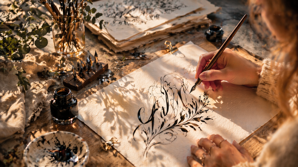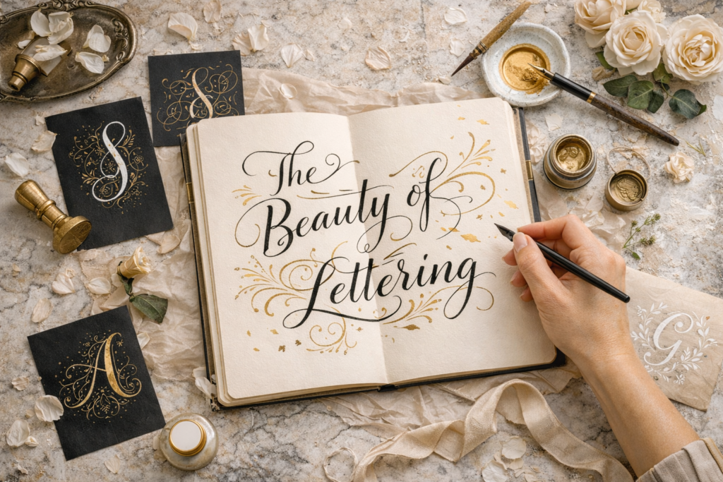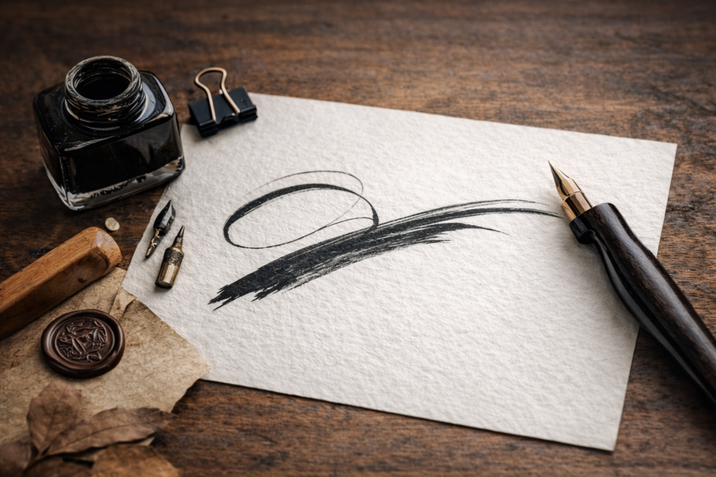

When people talk about beautiful calligraphy, they usually focus on the letterform or the quality of the line. But expressiveness is born not only inside the sign. It also lives in the space around it: in pauses, distances, margins, and the silent field of the page.
Space lets the letter breathe. It helps create rhythm, balance, calm, or tension. If letters sit too close, a composition becomes heavy. If they are too far apart, unity disappears. In calligraphy, emptiness is not background. It is an active compositional force.
The same word can feel entirely different depending on how much air surrounds it. Wide spacing may create silence and elegance. Denser spacing may create energy and ornament. That is why mature calligraphy always listens to the space between forms.
A beautiful line needs beautiful emptiness around it. When the eye feels air, the work becomes clearer, deeper, and more convincing.